Here is a tale of poor user experience in two iPhone screenshots.
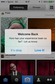
I clicked “It’s Okay.”
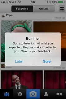
My first reaction was, “Well, fuck you! It’s not my fault you’re sorry! Thanks for the various options you gave me.” I don’t think that’s the user reaction they are looking for.
This whole problem could have been avoided with a non-binary choice. Or, it could have been avoided by not forcing me to click one of these buttons in order to use the app. I’m a Flickr Pro user so any “you get it for free” argument does not apply to me.
I do not choose to for-free help you improve your product. Instead, I’ll give you the name and contact of my wife who will be happy to do it on a professional basis. Instead of giving me “Later” implying that I’ll do it and “Sure” implying that I’m a teenager, how about “Yes” or “No.”
Leave a Reply