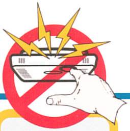
My wife is a professor of technical communication at Georgia State University. On her twisty never-ending road to the Ph.D. she taught many undergraduates many courses. One small module of one of these courses was on Icons, and their utility in communicating important messages. As an exercise, she would have the class try to design an icon that could be used on a nuclear waste facility, to be understood for all time by humans, despite any changes that might occur to society, civilization, etc. A permanent message saying, “Do not touch this!” It’s a difficult problem, demanding more psychology than graphic design skill, in my opinion.
Then you get icons like the image above. A worthless coupling of inconsistent themes. Does this mean, “If you touch, be prepared for shock?” How about, “If you touch this, it will explode.”
The context of the message helps out, but this only makes sense if you already know what it means. And if you know what it means, why bother having this message? It boggles the foot.

Leave a Reply